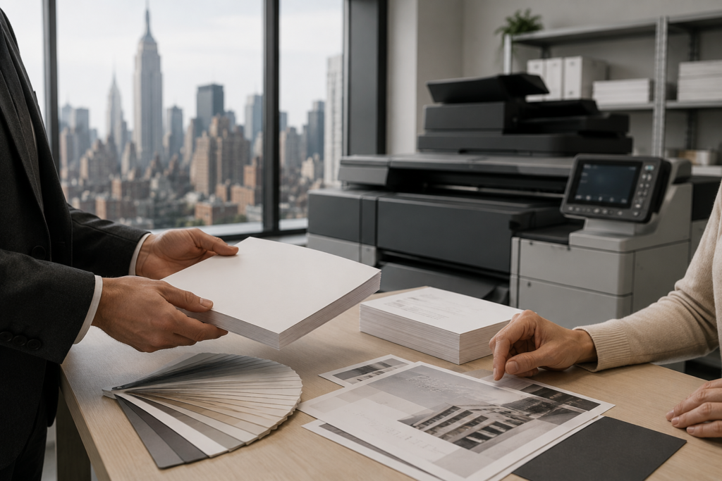
Inspiration 08.04.16
Creative Inspiration: Two-Letter Logo Techniques

julian
1. Use of Negative Space
With correctly manipulated negative space you can create a unique, effective logo design. You can manipulate the ready existing negative space, or you can add negative space. Adding negative space can be achieved by cutting one letter out from the other, this way one letter can be visually seen in the negative space, while the other character is still clearly visible. Sometimes you are also able to play with the interior, the already existing negative space within a letter. You can feature the other letter using this method, or you can even fill the space with a symbol or illustration for personality.
2. Use of Reflections
Letters can appear to look like mirror images of one another, or as a vertical reflection. When placed together they quickly create a visual connection, especially when you utilize an effective font. You can reflect the same letter and sometimes you can create an optical reflection with different words. “M” and “W,” d” and “p”, and “d” and “b” are also reflections of one another. Some work as a horizontal reflection, while other letter pairs work as a vertical reflection.
3. Use of Similar Letters
If you happen to have a company that features several pairs of letters that are similar visually, this can be a very efficient method. Look at Volkswagen’s logo; they just use two letters, “V” and “W’. Other letter pairs that look visually similar is “M” and “N” and “M” and “W.” It is important to do this with lowercase letters as well. The uppercase versions may not look similar, but the lowercase version does.
4. Use of Symbols
This method can be tricky and will not work for everyone, but if you happen to have letters that work you can create a unique design. This approach varies depending on the available letters and the brand, but it might be possible to ditch letters altogether and use an illustration or symbol instead. However, it is important that the drawing or symbol should still resemble the letters. It is crucial that the viewers can understand the message, so maintain readability.
5. Use of Cropping
Sometimes letters just work well together as is, and some need a little help. Often, you can remove or crop an aspect of the letters to create the appearance of both letters being tied closer together. To create a cohesive logo you have the option to remove just part of a stroke or a full stroke to connect two letters. This ability will vary depending on the letters and the fonts used, and it is important to maintain readability. Also, sometimes cropping both of the letters that don’t have the same visual height can help maintain balance. The human eye can fill in the blanks.