Inspiration 04.17.15
Logo Trends of 2015

julian
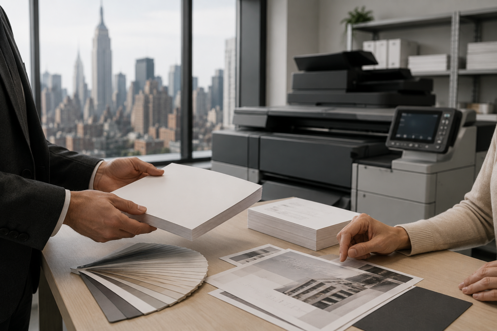
With new design techniques and fresh young minds, comes new creativity and endless possibilities. If you’re in the process of redesigning your logo, or planning a re-fresh of your existing brand, then this article is for you!

Negative Space
Sometimes, the key is simplicity. According to Creative Bloq, “the space that surrounds an object in a image. Just as important as that object itself, negative space helps to define the boundaries of positive space and brings balance to a composition.” This simple, yet striking design could be the cure to YOUR “creative block.”

Filipino designer Harvey Esparcia who uses negative space to combine his initial letters.
![]()
Low Polygon
In 2014, Low polygon was mostly used in backgrounds and wallpapers. It has now become a trend in defining the boundaries of logo design. This technique came from various features of 3D softwares such as C4D or Maya. It gives the designer the freedom to play with colors, textures, and use various blends of hues, while keeping the basic design element in the spotlight.
![]()
![]()
3D Metal Usage
This design technique gives a metallic look, similar to emblems used in car logos. It is a statement piece, meant to leave a strong impression on your viewers. It has been seen frequently in the fashion industry .
![]()
![]()
Vintage Flourish
According to Design Bolts, “these kind of logo designs are usually demanded by wedding companies, photographers, interior companies etc. It gives a well decorated look to the logo designs.” This technique is usually very detail oriented and delicate.
![]()
![]()
Overlapping
This is a playful and simple technique in which the lines of the figure overlap each other, breaking the ordinary boundaries of an ordinary image. It has the potential to give some extra depth to your logo.
![]()
![]()