Conversation, Inspiration 01.30.20
Horizontal vs. Vertical Business Cards

julian

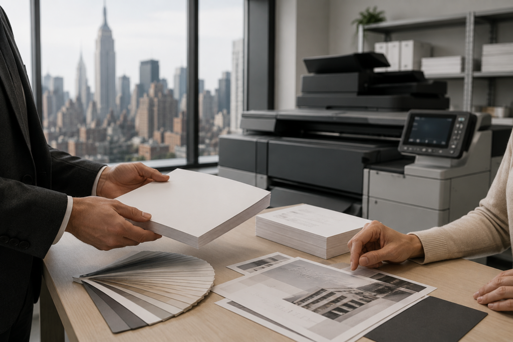
One aspect of business card design that often gets overlooked is the decision to go vertical or horizontal. By that, we mean, do you want your business card to have a horizontal layout or a vertical layout? If you are creating your very first business card, or maybe you are looking to change this up a bit, this is a design aspect that you do not want to forget about. There are pros and cons to using either a vertical or horizontal card, so if you want help making a decision about your business card layout, read on to see if you should go vertical or horizontal.
The Pros and Cons of Vertical Business Cards
Pros:
If you are looking for a way to stand out among the sea of business cards, going vertical is a good way to go. Remember, different isn’t always bad, and you want to find a way to make a person take a second look at your business card, and using a vertical layout is an excellent way to do that. Plus, orientating type with your logo is often found to be easier. We often write and type using a vertical orientation, so your text is sure to fit well and look good in a vertical layout.
Cons:
While being different and unconventional does have it’s perks. There is also a downside. Sometimes people don’t like change, so being different from the pack could turn some people off. While it may seem trivial, if someone has a routine of using a business card wallet, and they can find it frustrating that they need to turn their head or turn their business card holder sideways. While this may seem like a minor detail, for some, this can be an important detail, and it can make them overlook your business card. On top of the fact that some people don’t like change, if you plan to include a long name or title on the business card, it might have a hard time fitting correctly on the business card.
The Pros and Cons of Horizontal Business Cards
Pros:
Doing the horizontal is the norm for business cards. A tried and true layout, you can never go wrong using a horizontal design. Not only is it safe, but it’s the format that everyone is used too. If you aren’t in the market for forcing change on your audience and like sticking with the tried and true, especially if you are in a conservative field, go with the horizontal layout for your business card.
Cons:
Going by layout alone, using a horizontal design is safe and can be rather boring. However, while you may not want to upset your audience, you need to find other ways to make your business card stand out. While this may seem like an easy task, it is often easier said than done. To stand out, a good logo and design are necessary, or maybe you need to utilize other finishes on your business card. While it’s possible to still stand out with a horizontal card, it can be a more difficult task, and might even cost you more money than using a vertical design.